1: The background...
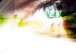
This is a wonderful first step that helps things speed along. I found this picture as a wallpaper that I hacked up a bit. I saw it and immediately knew it would be great for a Photoshop site. Now, I didn't do all the color transitions and fades that you see around the eye, so I can't take credit for that, but that's one of the things that makes the internet great. Everything's free and readily available. Why spend hours, or days, working on something that someone else has already done, and probably did better. On top of that, it can give you a creative boost in deciding what the rest of the graphics should look like.
2: The "tutorial"...
This was relatively simple. I chose a font that I liked, saw the color and thought it would look nice with the eye. Then I used the layer's "blending options" and chose "inner shadow" and "stroke". For some reason, Photoshop always defaults shadows to 120, but I prefer 135. I try to keep all my lighting at 45 degree intervals. It helps me keep things standardized, plus, it's easy to remember. As for the stroke, it defaulted to a 3px red line on the outside. I simply changed that to a shade of grey, set the width to 1px, and the position to center.
3: The "photoshop"...
This was a little more difficult. The shadowy effect wasn't too hard, again done with the layer's "blending options". I simply chose a nice green color to match around the eye and used the options "bevel and emboss", along with it's sub-options "contour" and "texture". I simply used default values for all, since they seemed to work well. The hard part, and it wasn't hard, once I figured it out, was getting the placement and angles right. I tried all these different "warped text" options and I kept getting close, but not right, since the line is all crooked. Well, I decided to check out some other tutorial sites and I saw one on docking text around a circle. That seemed to be just what I was looking for. Well, as it turns out, the tutorial didn't help at all, excepting that it showed me the tool that I needed to do it right. That was, simply, the free transform tool. I typed the text, put it where I wanted, and then turned it a little until the desired effect was completed.